Charts as Tools, Charts as Teachers
We’ve all been in (or, at times, have been) the classroom that has chart paper as wallpaper. Every open space, and maybe even open window, is occupied by a chart. Looking across the charts, there seems to be no common theme. There are both nonfiction and fantasy reading charts, personal-narrative and feature-article-writing charts. The room is, literally, a record of all the teaching that has happened across the year. If you ask the students to show you the charts that reflect the work they’re currently doing, they look at you with a blank stare or look from one chart to the other, not sure where the charts they need are.
We’ve worked to grow to see charts as tools and teachers rather than as a record of the teaching we’ve done. That might seem like a subtle shift, but we think it’s an important one. It moves charts to being for the learners in our room rather than for the teachers in the room. Some ways that we’ve made this shift are to co-author the charts with or in front of our students, make them interactive, and make them accessible.
Co-Author Charts
Although we might make the bones of a chart before a minilesson, we do most of the writing on it in front of the students and refer to it throughout the minilesson. Similarly, our charts grow and change across a unit. The chart below, for example, would likely be introduced with the title (in orange) and the two columns (in blue) already on it. Then, across the days and weeks of the unit, we add the bullet points to the chart, usually pausing during the teaching point of the minilesson.
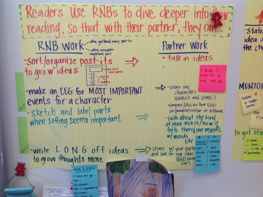
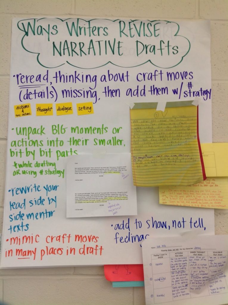
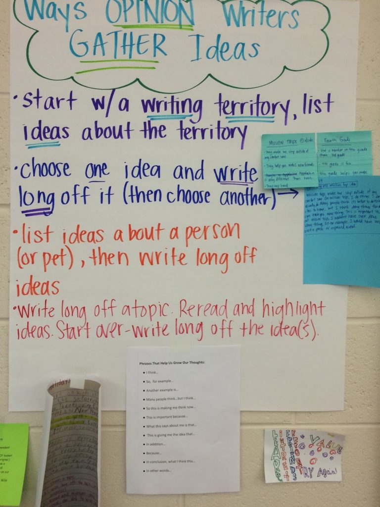
Another way we co-author the charts with our students is to add the examples used during the minilesson. These shared examples help to remind and to reinforce the learning that was done. On the chart above, the blue and pink sticky notes show work that was done during the minilessons, during either the teaching or the active engagement (or, often, both) and then added to the chart at the end. The chart below also has examples used during the minilesson, but most of them are examples of student work that was used during the teaching part of the lesson.
These are the yellow notebook pages and the white computer-printed pages on which we highlighted the parts focused on.
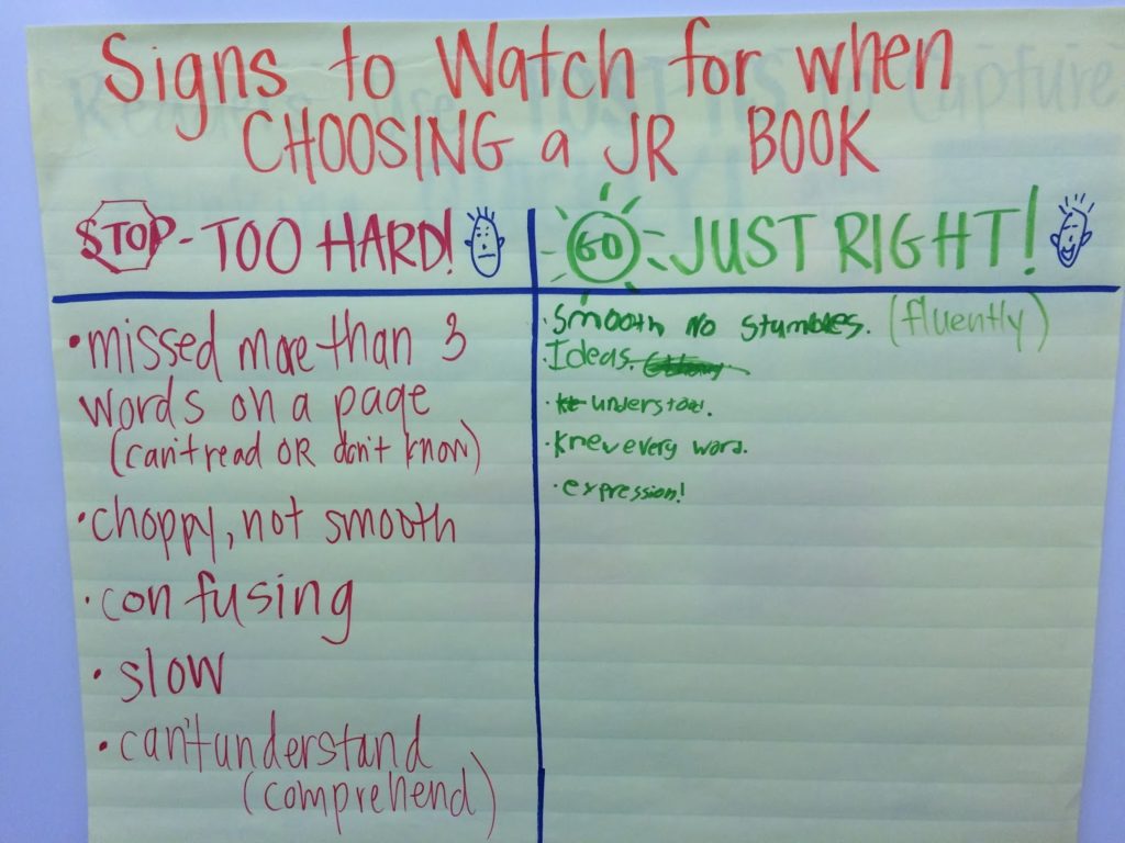
We will also sometimes have the students actually write things on the chart during the minilesson, which is maybe co-authoring in a truer sense, as they did with the green column in the chart below.
Although we’ve definitely thought through the language we’ll use and how the chart might end up looking at the end (charts are one thing we plan when preparing a unit of study), we believe that creating the charts in front of the students is essential if we’re going to expect them to know what’s on the charts and, even more important, use the charts independently.
Make Charts Interactive
Charts in our room almost always have lots of different sticky notes on them. The sticky notes might show steps in a strategy or work that illustrates the strategy being used. We also use sticky-note tape to make anything able to stick to the chart.
The purpose of using sticky notes and sticky-note tape is for students to be able to remove those items and use them as tools where they’re working. We make sure to show students how they can borrow them and return them when they’re finished. We spotlight and celebrate when students are beginning to do this so that it catches on across the class. That way, the chart is being returned to again and again and students know it is a tool that has been made for them.
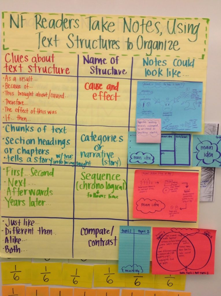
In the chart below, the third column has sticky notes that show how students might structure their nonfiction notes. Some of the sticky notes are just reminders of how the structure might look, whereas others show the structure with actual notes taken as a class during the minilesson or read-aloud. Students can remove the sticky notes to support them as they take notes on their reading.
In the chart below, there are parts that can be removed that include work done collaboratively during the minilesson, work shown as a model during a minilesson, and phrases to support students in their writing.
Make Charts Accessible
Because almost all of our charts are interactive, it’s important that students know where they are and that they’re able to reach them.
The first step we’ve taken to help our charts be more accessible to our students is to color-code them. We mostly use the large sticky-note chart paper, and use the yellow lined chart paper for reading charts and the white chart paper for writing charts. That way, students can narrow down which chart will support their work just by looking at its color.We’ve also grouped our reading charts together and our writing charts together, and put a star sticky note in the corner of the writing chart that shows the part of the process we’re currently on. For example, across a narrative unit we’ll have a different chart for each part of the process, and these charts will remain accessible for the duration of the unit since our students might be at different parts of the writing process. If our minilessons are focusing on revision strategies, though, the star sticky note will be on the revision chart. We also have a part of the room dedicated to math charts and science or social studies charts.
Once we’ve moved on from a unit, we take the charts down. Sometimes we throw a chart away, and other times we tuck it away in a closet. (If we just finished our first nonfiction unit, we’ll likely use those charts later, and narrative charts for writing can be used across personal narrative, fiction, and fantasy units.) Before we take the chart down, we always take a photo of it and upload it to a shared folder organized by subjects that our students can access. We make a link on the homepage of our class iPads. The photo below shows what the page looks like when students open the link to our reading charts.

We tend to take a photo and catalog the charts at the end of the unit, since the chart is more finalized by then, but because our fourth graders are comfortable using iPads, it’s not uncommon for them to take photos of the chart before it’s been uploaded to the shared folder so that they’re able to see something more easily as they work. (And we, of course, celebrate and do a dance inside about their resourcefulness.)
We know that the way charts are structured will differ across grades or student populations (for example, there may be more visuals and less print for young children), but we think that when charts are co-authored, interactive, and accessible, it helps them be used more as tools and as teachers across grade levels and student populations.
No comments:
Post a Comment